
"Anyone who stops learning is old, whether at twenty or eighty. Anyone who keeps learning stays young. The greatest thing in life is to keep your mind young".
Henry Ford
Here is your resource to learn the unvarnished truth about how the stock market truly works. No jargon, no nonsense, just plain English. I have put together what I consider to be the most important things that you should understand about investing before you part with your hard-earned cash. The more you understand the better you will able to control your emotions and your expectations on what you want your investments to do for you.
So, dive in, have a good look around and enjoy the experience.
Most of the clients I meet come in to see me with a bag full of M&M’s and I’m not talking about the chocolate variety. I am referring to misconceptions and misunderstandings around investing. Many clients have been carrying around a lot of misinformation for years, titbits of information that they have picked up from here and there which they understand to be factually correct but are in fact not true. If they are making important decisions based on wrong information, they could end up making some of the biggest financial mistakes of their life.
“History doesn’t repeat itself, but it often rhymes.” – Mark Twain
One of the most common mistakes is misunderstanding how long stock markets take to recover after a market crash. This picture shows you historically how long the markets have taken to fully recover to their previous highs and how long they have taken to recover 50% of their temporary falls.
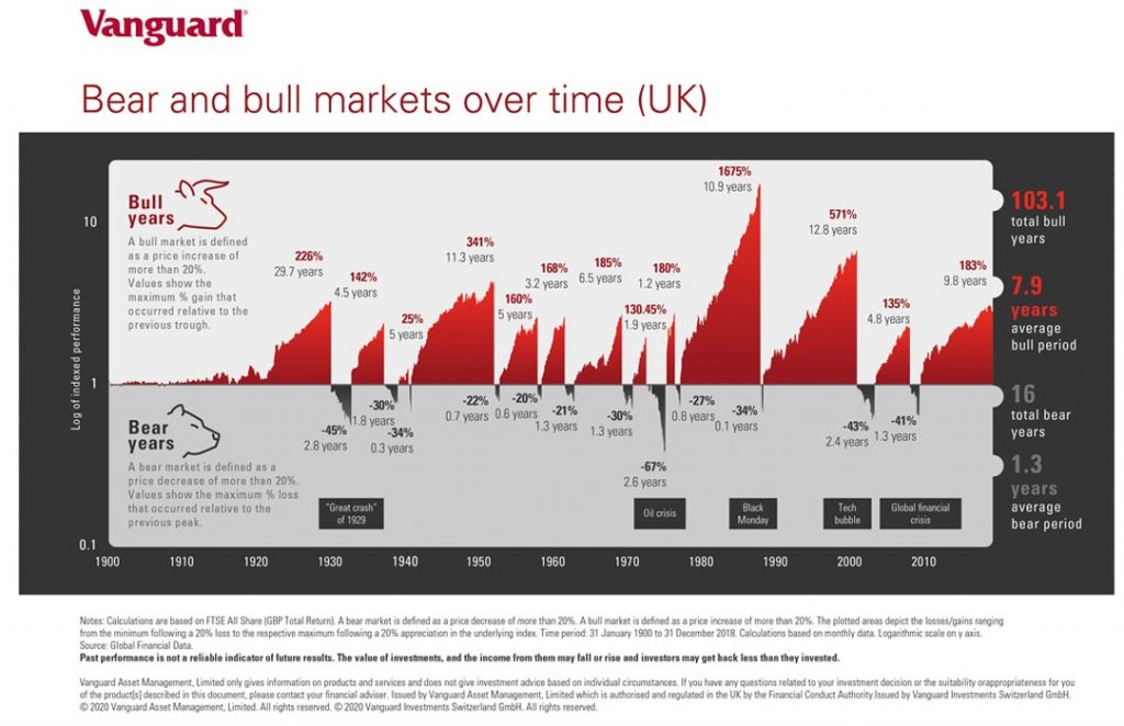
Finally, this image shows how long the best and worst periods to invest have lasted over the last 100 years. Notice the difference between how long the good times (bull markets) have lasted in contrast to how long the bad (bear market) times have lasted. This graph proves that that the long-term investor is rewarded for staying the course and that the stock market goes u an awful lot more than it goes down over the long term. If history proves anything it is that in the stock market reversals are temporary whereas advances are permanent.
DON’T FOCUS ON THE INDEX, FOCUS ON THE TOTAL RETURN
There is a fundamental flaw with the way that the stock market is measured by the index of the UK’s biggest firms, the FTSE 100, and its cousins, the mid-range FTSE 250 and broader FTSE All-Share.
All of them put forward an index based on companies’ share prices, but that’s not what delivers long-term investment returns.
What is far more important is the overall reward you get from holding shares in the biggest companies on the planet because a big chunk of your investment return comes from dividend pay-outs compounded over time.
To measure that you need a total return index – and while FTSE compiles these for its main indices, they are not widely-published, despite the fact that you’d think it would definitely be in the London Stock Exchange or investment platforms’ interests to do so.
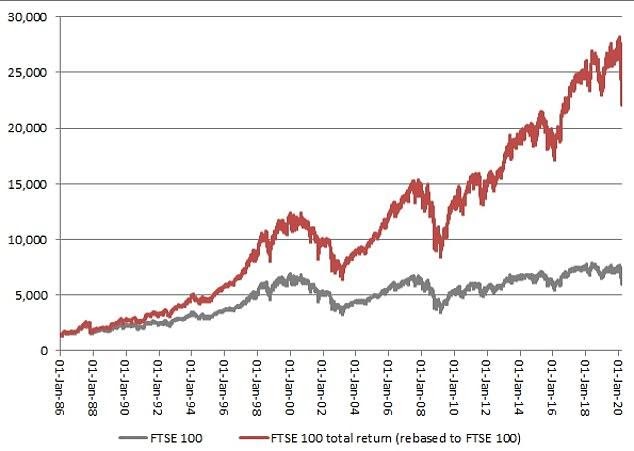
What a difference a dividend makes: This chart shows the standard FTSE 100 index (grey) since 1986 compared to the FTSE 100 total return index (red) over the same period
Take the FTSE 100 Total Return index figures and the picture over the past 30 odd years from January 1986 to January 2020 and the picture looks very different.
On 31 December 1999, the FTSE 100 stood at 6,930, whereas when the stock market closed on Monday the 11th of May 2020 after its bumper 7.7 per cent one-day fall it was at 5,966 – a 14 percent decline.
In contrast, on 31 December 1999, the FTSE 100 Total Return index stood at 12,447, whereas it closed on Monday the 11th of May 2020 at 22,114 – a 77 per cent rise.
Over 20 years, that is a 2.86 per cent average annual return, which in all honesty is pretty poor for two decades of investing.
It’s only slightly better than inflation/the cost of living, which has increased by 75 percent since the start of 2000, but you would have struggled to match that return with money sat in a bank savings account all this time and on the bright side, it is still better than a poke in the eye with a pointed stick.
It is also very important to note that if you’ve spent the last 20 years only investing in something that tracks the FTSE 100 then you are doing it all wrong.
Investments should be far more diversified than just the UK’s top 100 companies, or even the broader FTSE All-Share basket that includes much more of Britain’s stock-market listed firms.
Ideally, you should start at the position by behaving like a James Bond villain of owning the world, by investing in a an index tracker fund that that invests in companies around the planet – and then if you want a bit more UK exposure you add a small dollop in.
Those who invested in a global fund would have seen a much better return over the past 20 years than even the total return versions of the FTSE 100 or All-Share would have offered.
If you want to reassure yourself during times when the stock markets plunge into the red, it’s worth remembering the incredible effect that compounded dividends has over time on the total returns instead of dwelling on one very misleading stock market index.
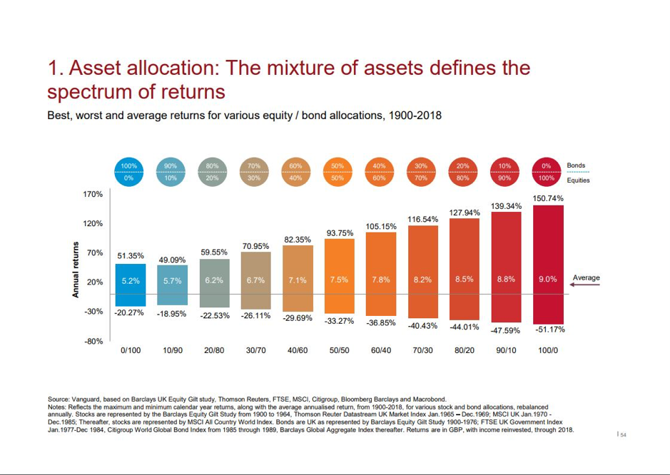
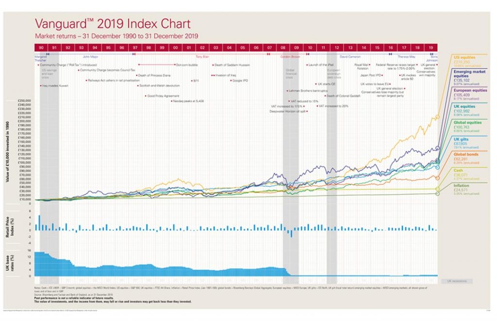
This chart illustrates perfectly how risk and reward always go hand in hand. Over the long term, greater exposure to the stock market (the biggest companies on planet earth that you and I use on a daily basis) has easily produced the better returns but you must be able to stomach greater volatility along the way whereas reduced access to the stock market historically produces much lower returns the less exposure you have, but you have less volatility along the way.
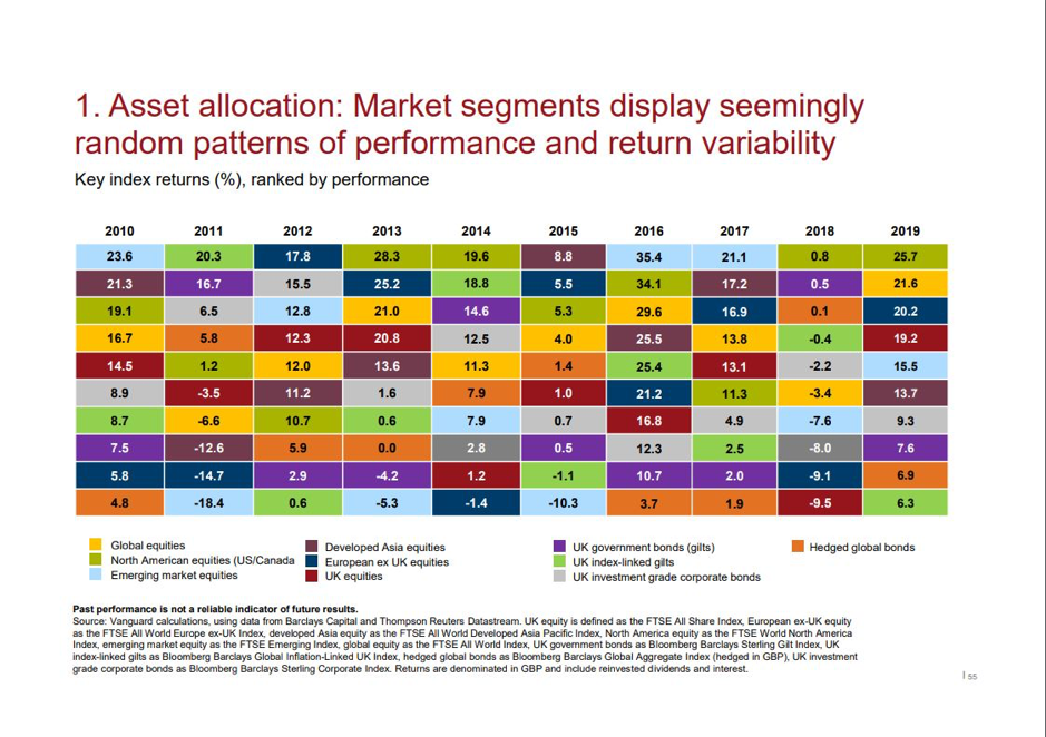
This chart proves conclusively just how difficult it is for anyone to pick which asset classes are always outperforming the others on a consistent basis. The stock market is cyclical with many moving parts and information is changing by the second. The global economy will dictate which sectors and assets are doing well at any given moment and which ones are not. As such, it is virtually impossible to be invested in the all right areas all of the time. This is precisely why having a highly diversified portfolio is so important. It is my opinion that you should never own enough of any one thing that can either make or break you. In fact, it can be argued that if a part of your portfolio is not underperforming you are not as diversified as you should be. This is because it is wholly unrealistic to expect all of your investments to only increase in value every single day.
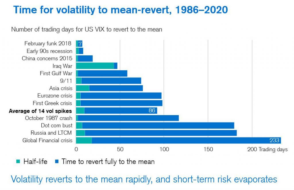
Produced with kind permission by Professor Elroy Dimson.
This image shows how long stock markets have taken to recover from down turns after major economic events. Notice how many days they have taken to fully recover to their pre-crisis values (the blue bars) and particularly how many days they have taken to recover 50% of these temporary losses (the green bars). The results might surprise you. If you look at the long-term history of the stock market, it has proven conclusively that reversals are temporary, but advances are permanent. This is why managing your behaviour around these temporary stock market falls is vitally important and that you do not ‘panic sell’ or make damaging, emotionally driven decisions when these inevitable events occur from time to time.
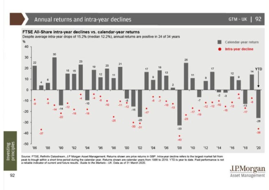
The graph above highlights the large swings of the FTSE All-Share index of every year since 1986. It might surprise you, but long term historic stock market returns have shown us that virtually every year the main global stock market indices such as the FTSE 100, the FTSE ALL Share Index and the USA S&P 500, suffer an average peak to trough swing of around 14%. In other words, if you had found the lowest point of a stock market index in any one year and the highest point in any one year, the difference is about 14% peak to trough on average historically. This is not at all unusual and is to be expected; it is a regular occurrence. It’s just that investors never notice or realise this as they never look for this information.
Taking a very long term look at the global stock markets, this is what appears to happen historically:
Market highs and lows move around about 14% in any given year on average over the long term. Stock markets have historically gone up in value about 80% of the time or 4 out of every 5 years on average, emphasis on the word ‘average’ not religiously every year (that would be too easy).
On average, once every 20 to 30 years you will experience a temporary crash of around 30%. The most recent one is the Covid-19 pandemic when global stock markets plunged around 25% before making a rapid recovery.
On average, once every 40 odd years or so you can possibly expect a 50% temporary drop in value. These are known as Black Swan events, and thankfully are a rarity. The last time this type of event occurred was in 2008. It was the Global Credit crisis. The market fell by 43% over a 2 years and 4 months, but then rebounded growing by 135% over the following 4 years and 8 months.
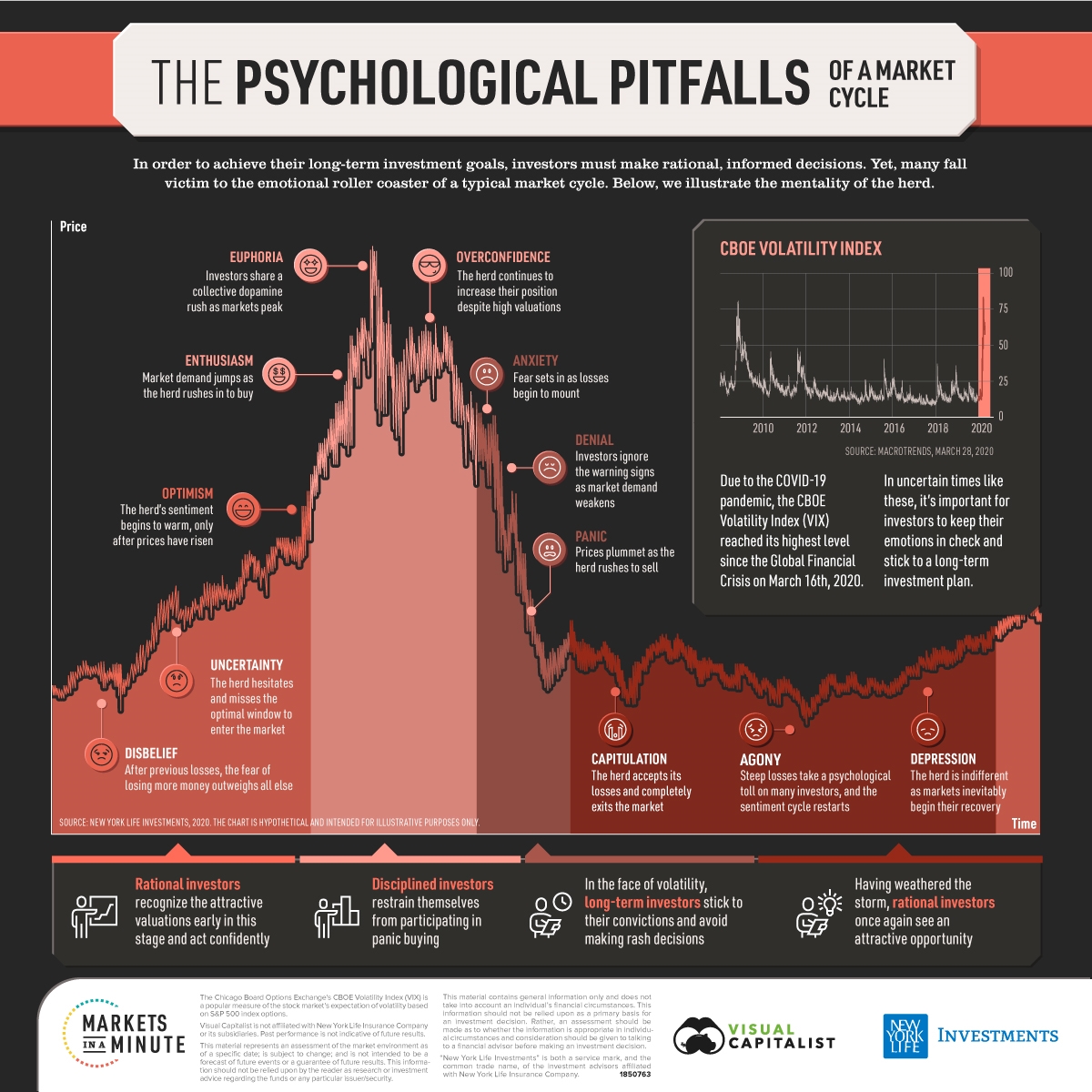
The good news is that these tough Bear Markets (declines) don’t last very long before things start to improve dramatically. The longest period of flat (no growth) or negative returns in the last 100 years was in the 1930’s in the great depression and it last 2 years and 8 months. Notice the number and lengths of the positive years growth as opposed to the negative periods and how long each has lasted historically. It is the stoic, patient investor who can remain resolute and who sticks to their plan through the tough times who gets rewarded for holding their nerve. (See the graph below)
Much of the data above can been found in the JP Morgan – Guide to the Markets.
